Biyiblip — Brand Identity from Scratch
Strategy, Identity and Visual System for a New Analog Synth Brand
From an idea with no name or visual identity to a complete international brand built for product, communication and motion.

What I did
Brand Strategy · Research · Workshops · Benchmarking · Naming Process · Creative Direction · Logo · Typography · Colour · Illustration · Photography · Brand Book · Motion
I created and led a branding methodology combining research, classical brand-development tools and custom exercises designed specifically for the project.
How I did it
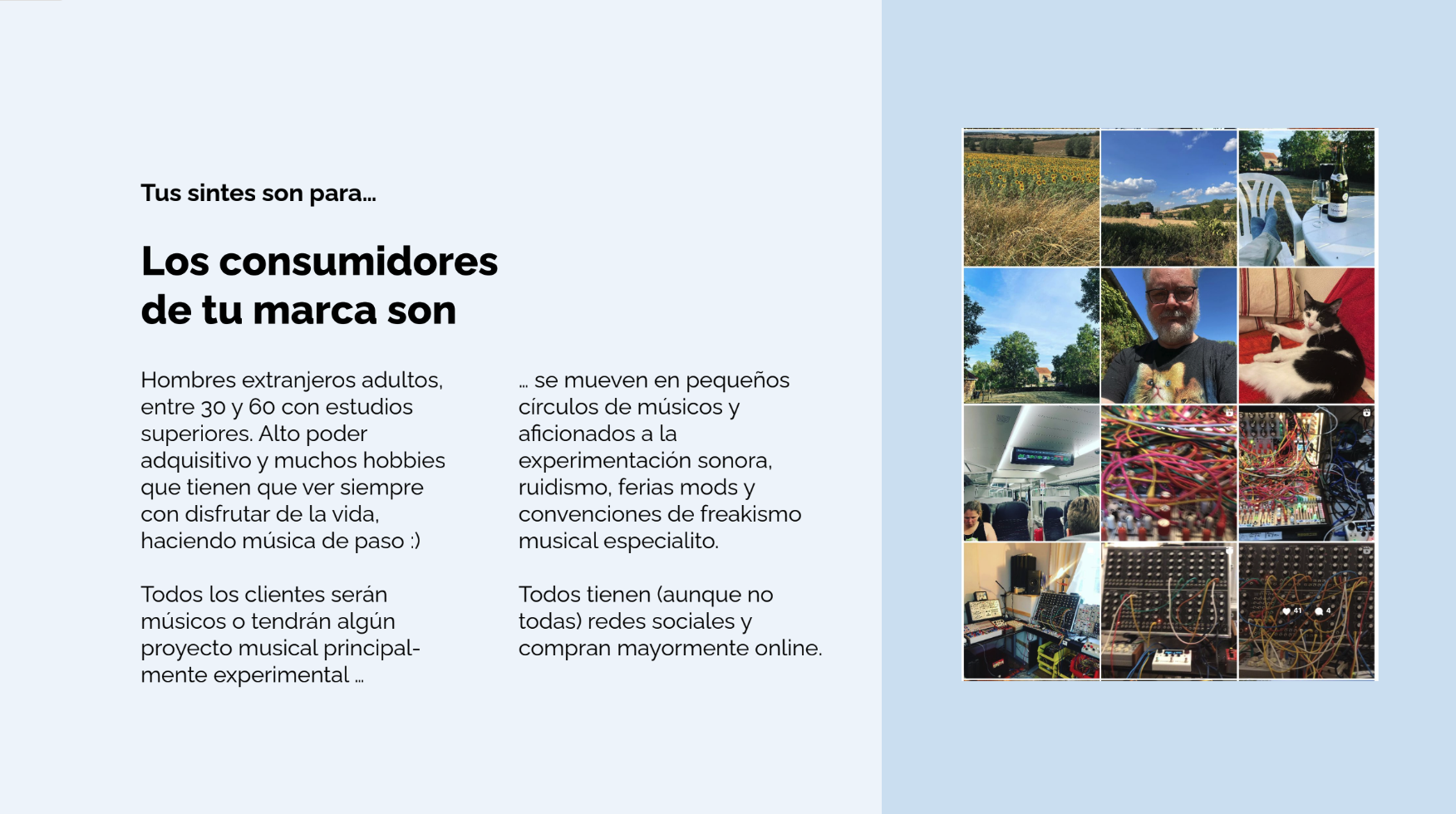
Research into customers, competitors and the modular synthesizer market revealed an opportunity to move away from the cold, dark and highly technological codes common in the sector.
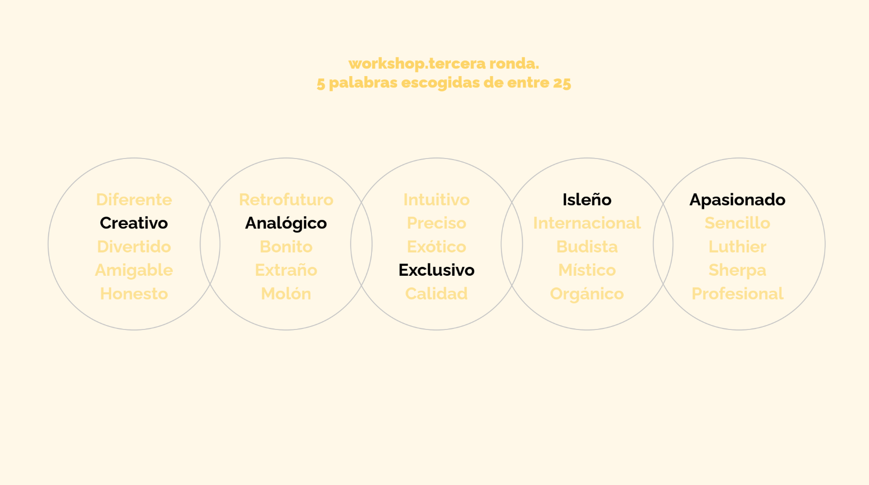
Through several workshop rounds, an initial set of around 120 attributes was reduced to five defining ideas:
What is it
When I started working with Biyi, an engineer and synthesizer designer connected to the legacy of modular synth creator Rob Hordijk, the company did not yet have a name, logo or defined brand.
Over approximately three months we built Biyiblip together from the ground up.
creative · analog · exclusive · island-born · passionate
These principles shaped a warmer, more human and Mediterranean identity centred around the idea:
Happy People Synths
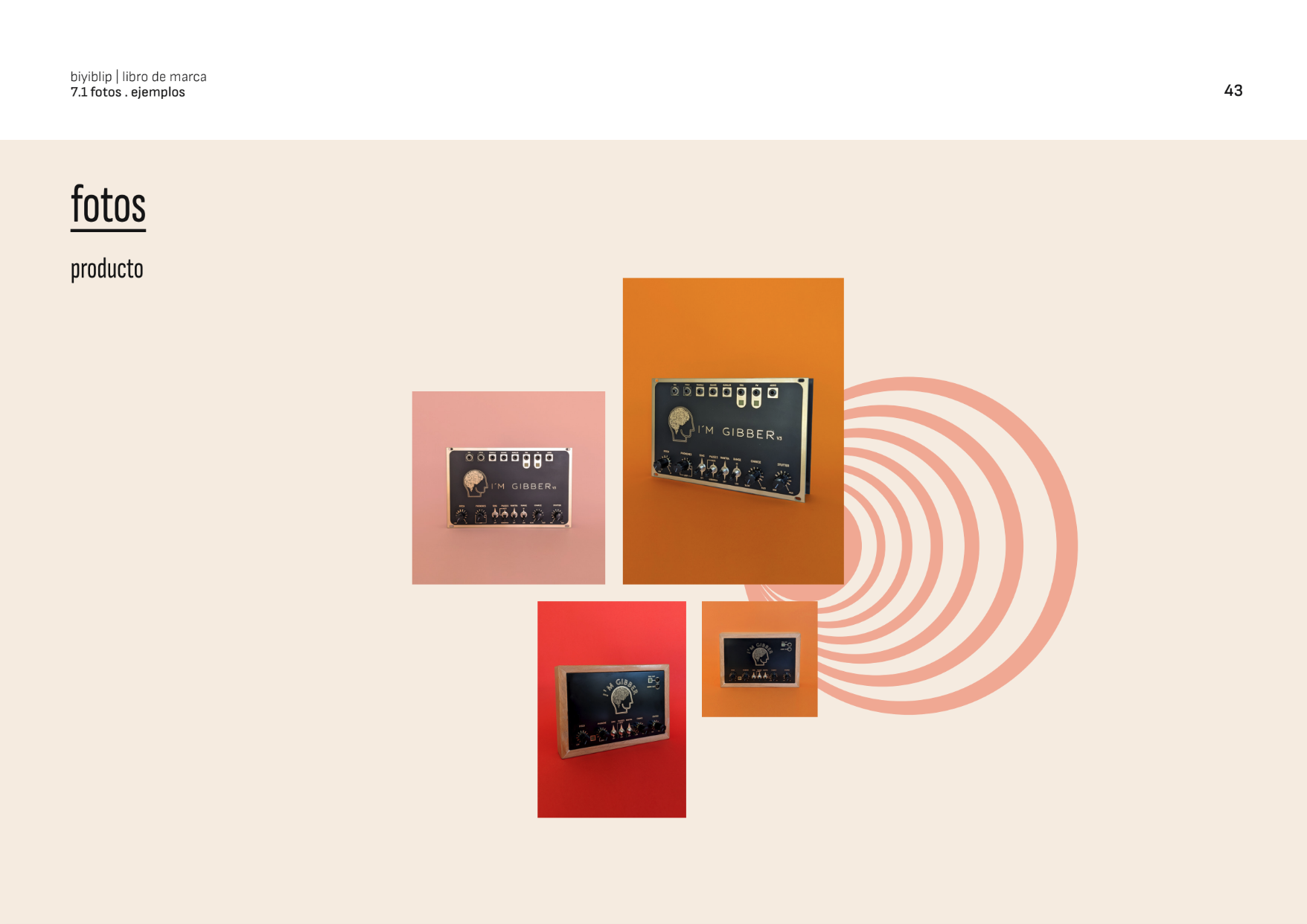
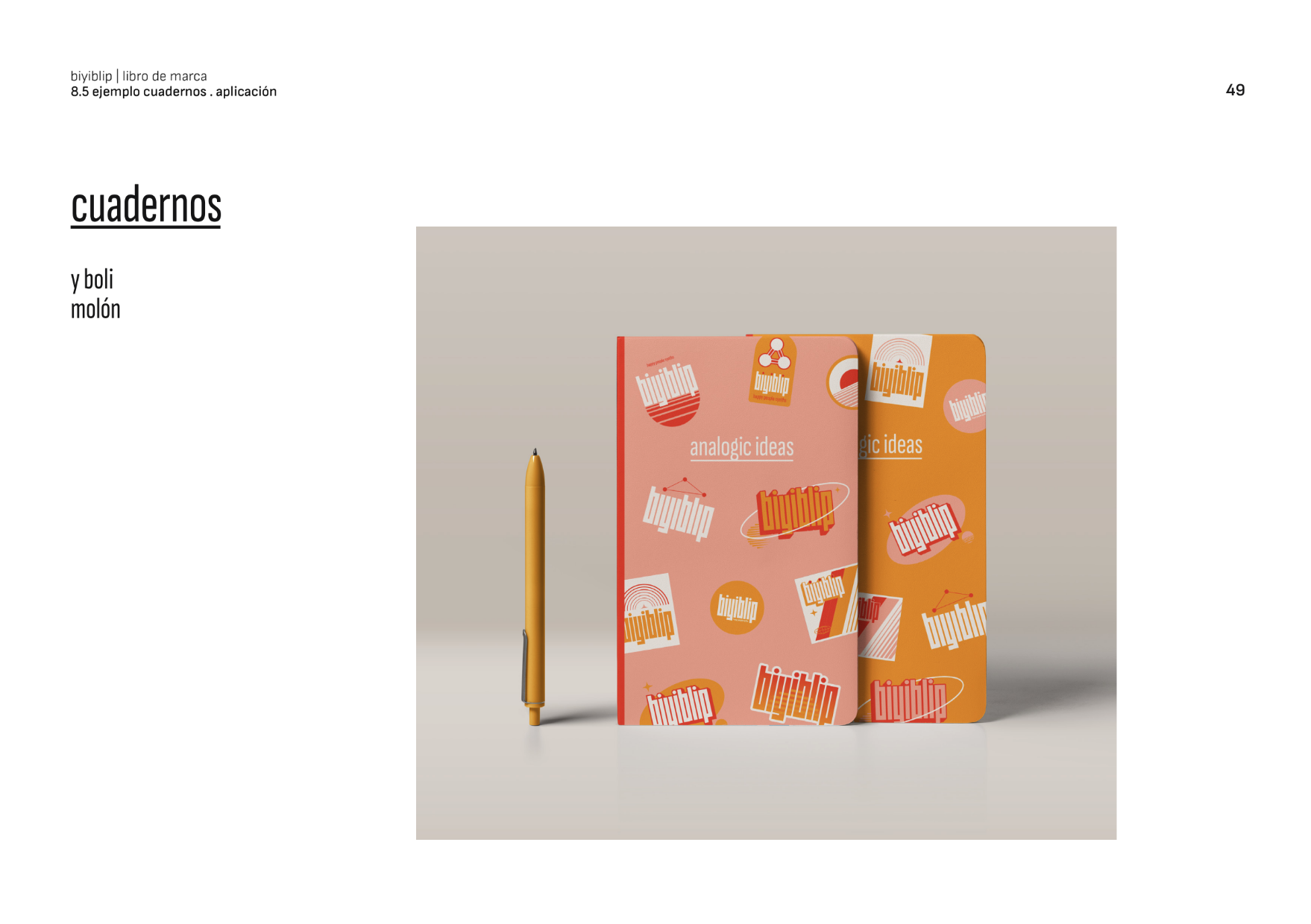
The visual system combined Sofia Sans with a colour palette inspired by Mallorca — charcoal black, sand white, Sta Ponça sun, salmon and tomato — and was designed to work across instruments, packaging, manuals, social communication, photography and motion.
The identity subsequently became the foundation for product launches including Gibber, Blipulator and BlippoBox.