Biyiblip
Building a Brand from Scratch
synths
The Challenge
Biyiblip started with a product ambition but no brand.
There was no name, logo, visual system or defined communication territory. At the same time, the company was entering an established international modular synthesizer market populated by brands with strong communities and recognisable visual codes.
The challenge was therefore not to decorate an existing business. It was to determine what the brand should stand for before deciding what it should look like.

Research & Strategy
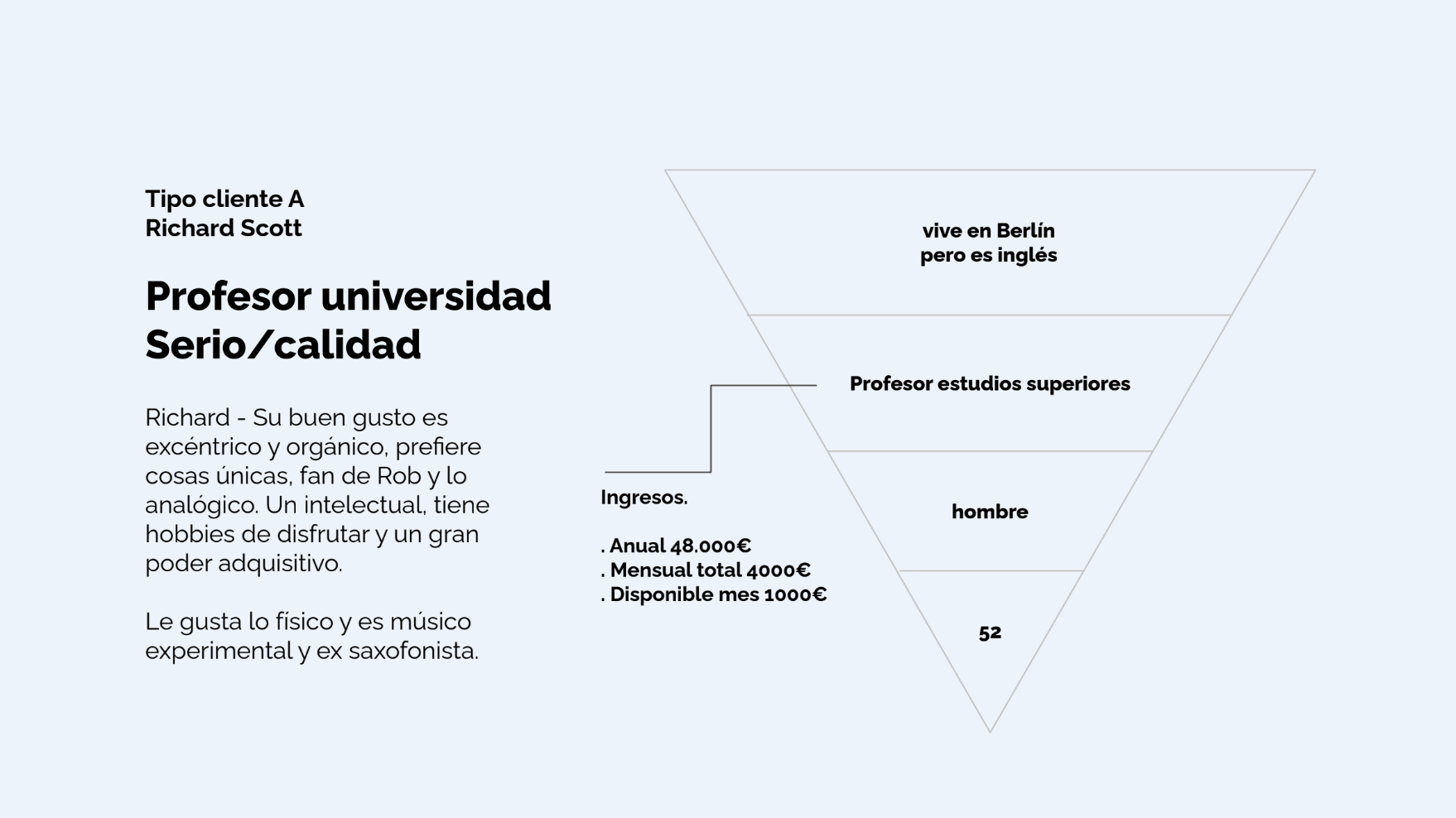
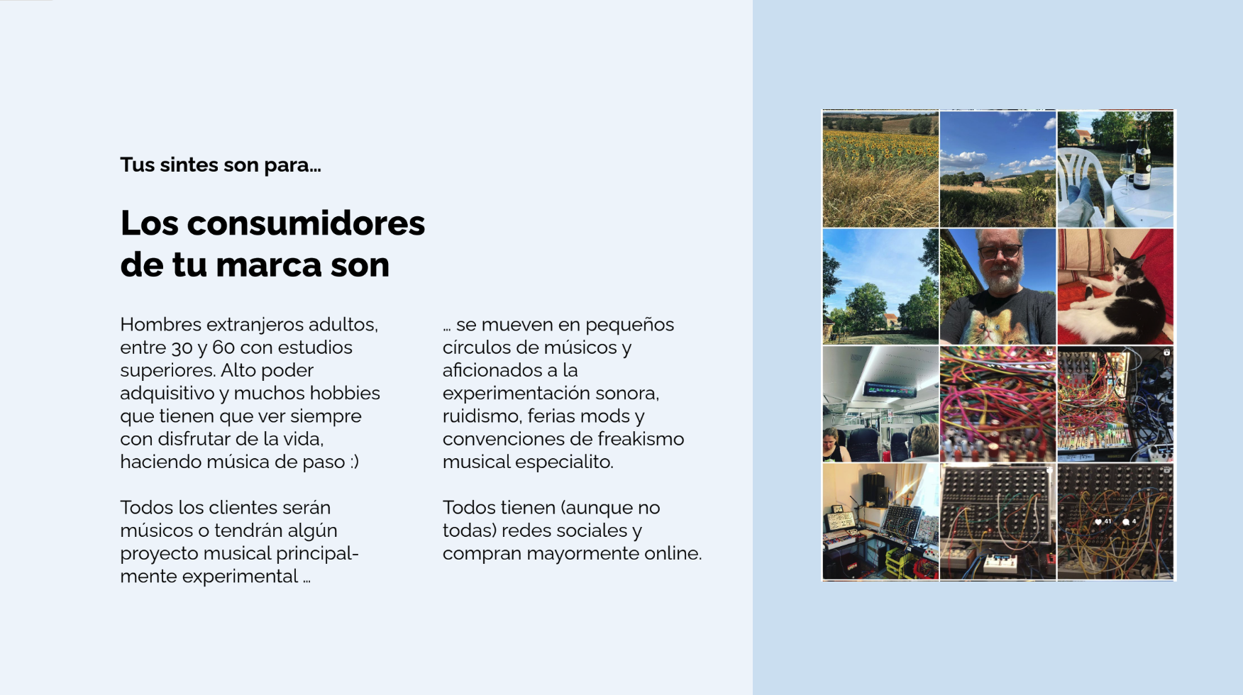
I structured the project through a custom branding methodology combining questionnaires, workshops, audience analysis, competitor benchmarking, keyword exercises and visual research.
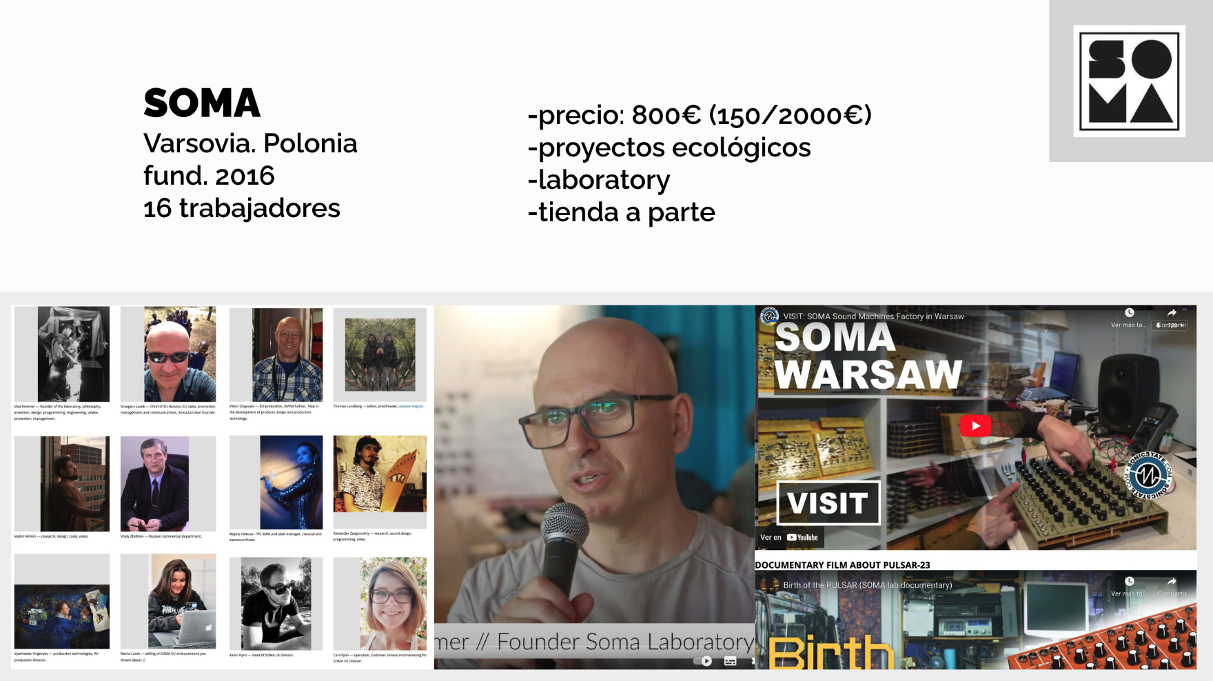
We examined the modular synthesizer market and brands including SOMA, Bastl, Intellijel and Erica Synths.
A recurring pattern emerged: strong use of black and white, technological or techno/Bauhaus aesthetics, restrained palettes and relatively serious communication.
This created an opportunity for a different position.
Defining the Brand
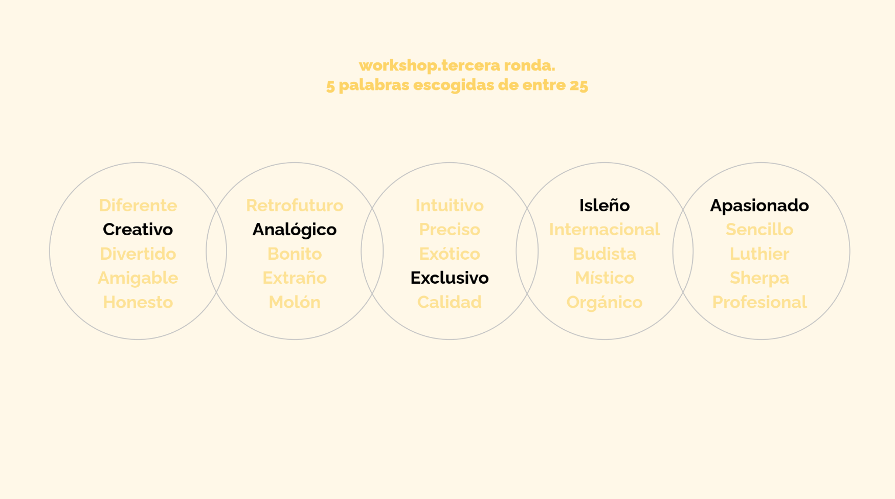
A series of workshops progressively reduced approximately 120 initial descriptors to five core attributes:
Creative · Analog · Exclusive · Islander · Passionate
These became the foundation for the brand strategy.
The purpose was defined around bringing the sounds in our imagination to life, while the wider communication territory focused on enjoyment, experimentation and the pleasure of making music.
That idea ultimately became:
Happy People Synths
The Visual System
The identity deliberately avoided the cold science-fiction aesthetic common in the sector.
Instead, we built a warmer and more Mediterranean language through typography, colour, photography and graphic composition.
The primary palette included colours named:
Charcoal Black
Sand White
Sta Ponça Sun
supported by salmon and tomato tones.
Sofia Sans provided a large and flexible typographic family capable of moving between expressive headlines, technical information and long-form manuals.
From Brand to Product
The system was designed to work beyond communication.
It included specific rules for applying the identity directly to synthesizers as well as packaging, manuals, e-commerce, photography, campaigns, social content, clothing, posters and motion.
This allowed the identity to remain coherent as Biyiblip expanded from its first product, Gibber, into later instruments including Blipulator and BlippoBox.
My Role
Creative Direction · Brand Strategy · Research · Workshop Design · Benchmarking · Naming Process · Visual Identity · Logo · Typography · Colour · Illustration · Photography · Brand Book · Motion Graphics
The project demonstrates my ability to move from ambiguity and research to strategy, identity and execution, and to turn that identity into a system capable of supporting real products and communication.