Citi - Rebrand Concept
Brand Strategy, Visual Identity & Digital Applications
A speculative rebranding proposal exploring how Citi’s identity could become simpler, more distinctive and more coherent across physical and digital touchpoints.
What is it
The project explored a possible evolution of Citi’s visual identity through brand analysis, competitor research and a redesign concept focused on simplification, clarity and global consistency.
The starting point was Citi’s own strategic emphasis on simplification, connectivity and international reach, together with an analysis of the existing identity and its visual limitations.
What I did
Brand Analysis · Competitor Research · Art Direction · Logo Redesign · Visual System · Typography · Colour · Graphic Language · Credit Card Design · Web Concept
I analysed the existing identity across criteria such as legibility, versatility, semantic clarity, reproducibility and brand equity, identifying which elements should be retained and which could be simplified or reinterpreted.
How I did it
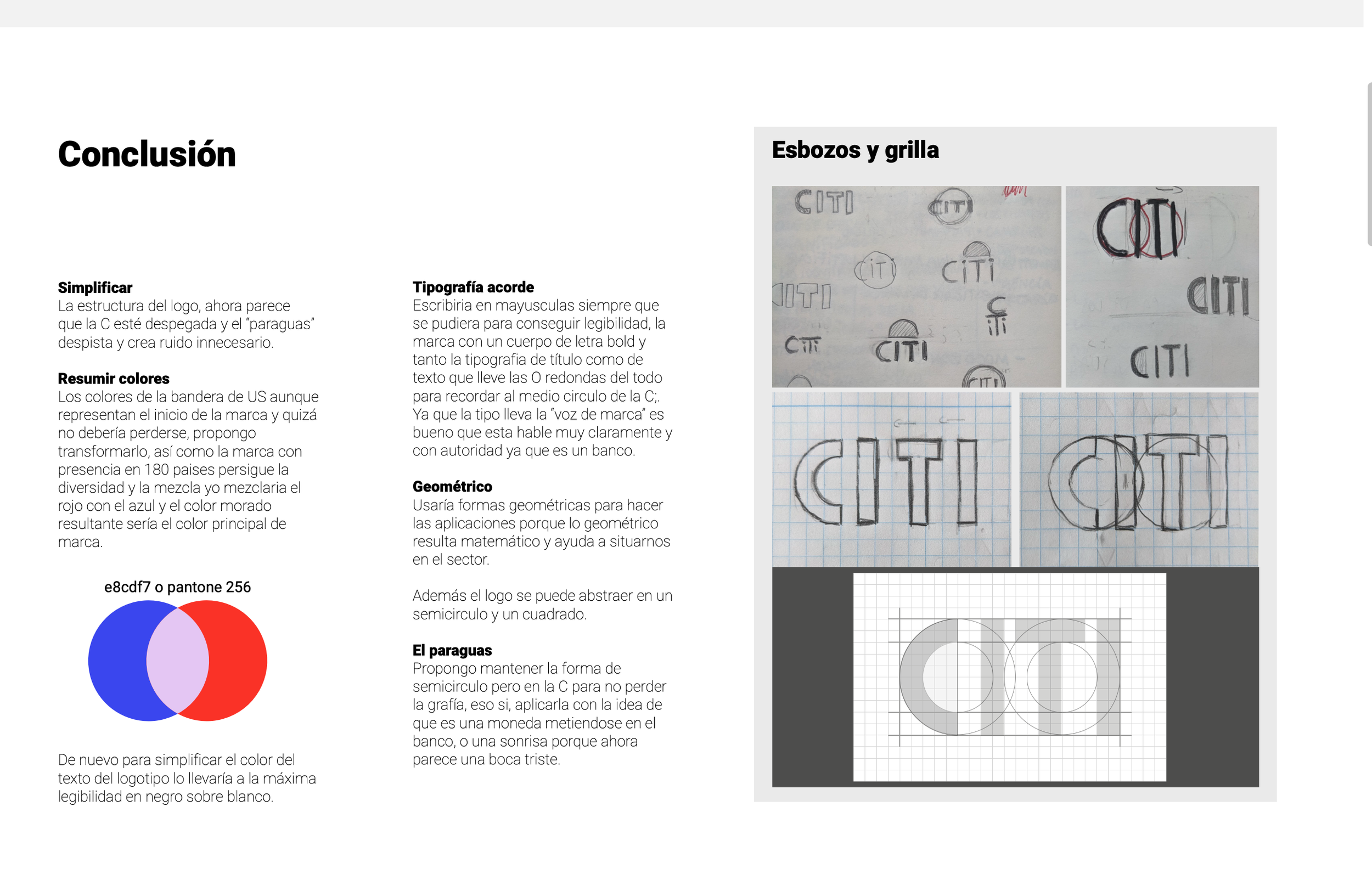
The process combined brand and competitor analysis with moodboarding, sketching and grid development.
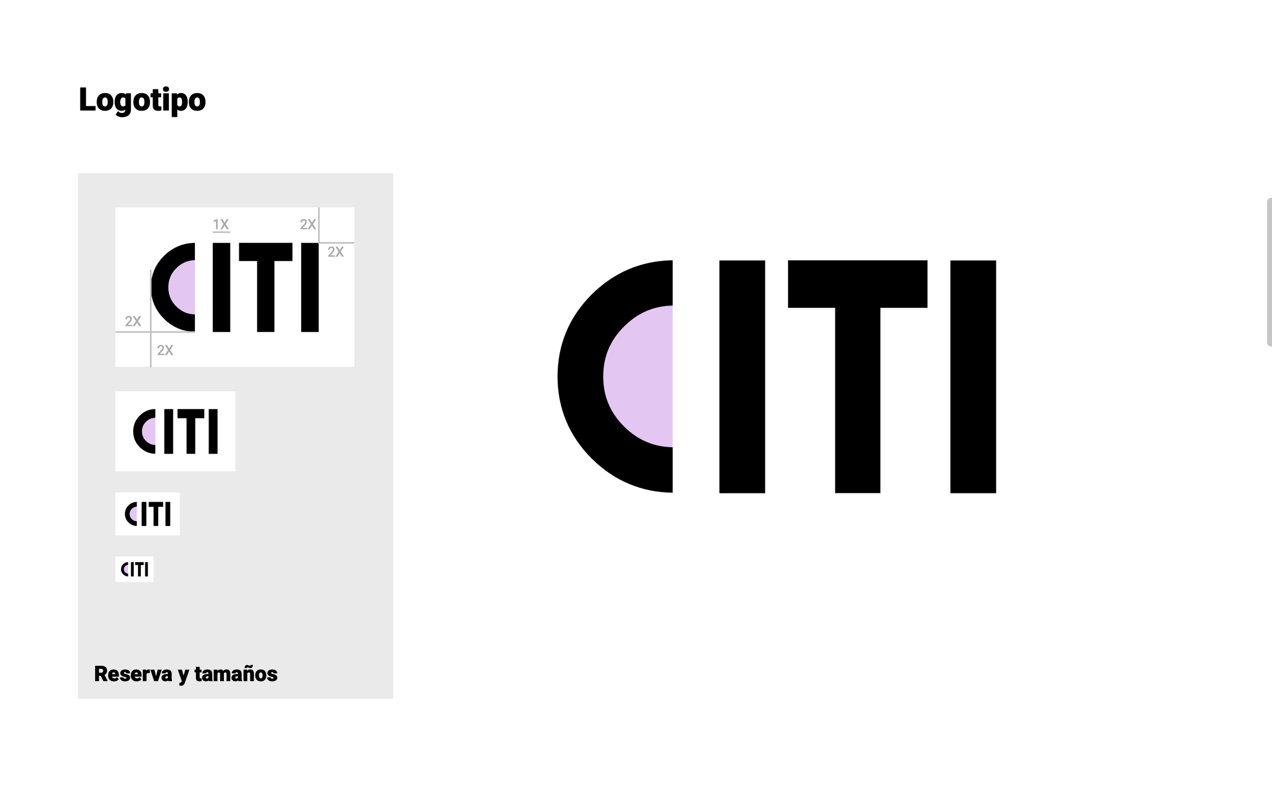
The redesign retained the recognisable Citi name and the semicircular gesture of the existing identity, but reinterpreted it as a simpler geometric system. The proposed palette merged Citi’s traditional red and blue into a softer purple, while black and white increased contrast and legibility.
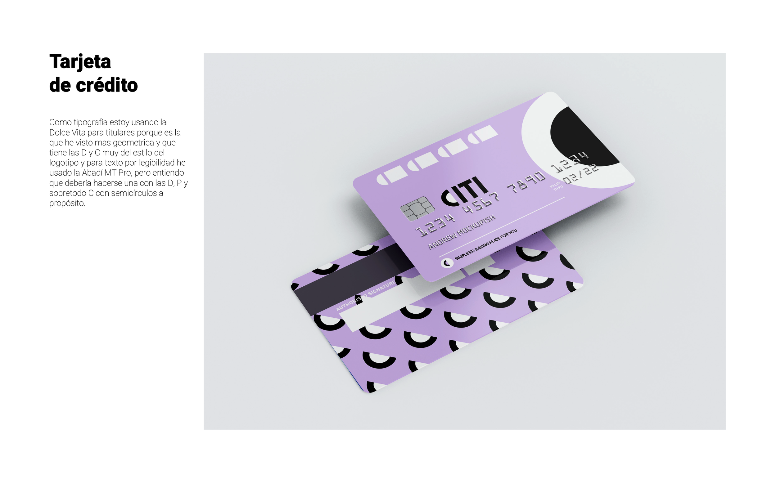
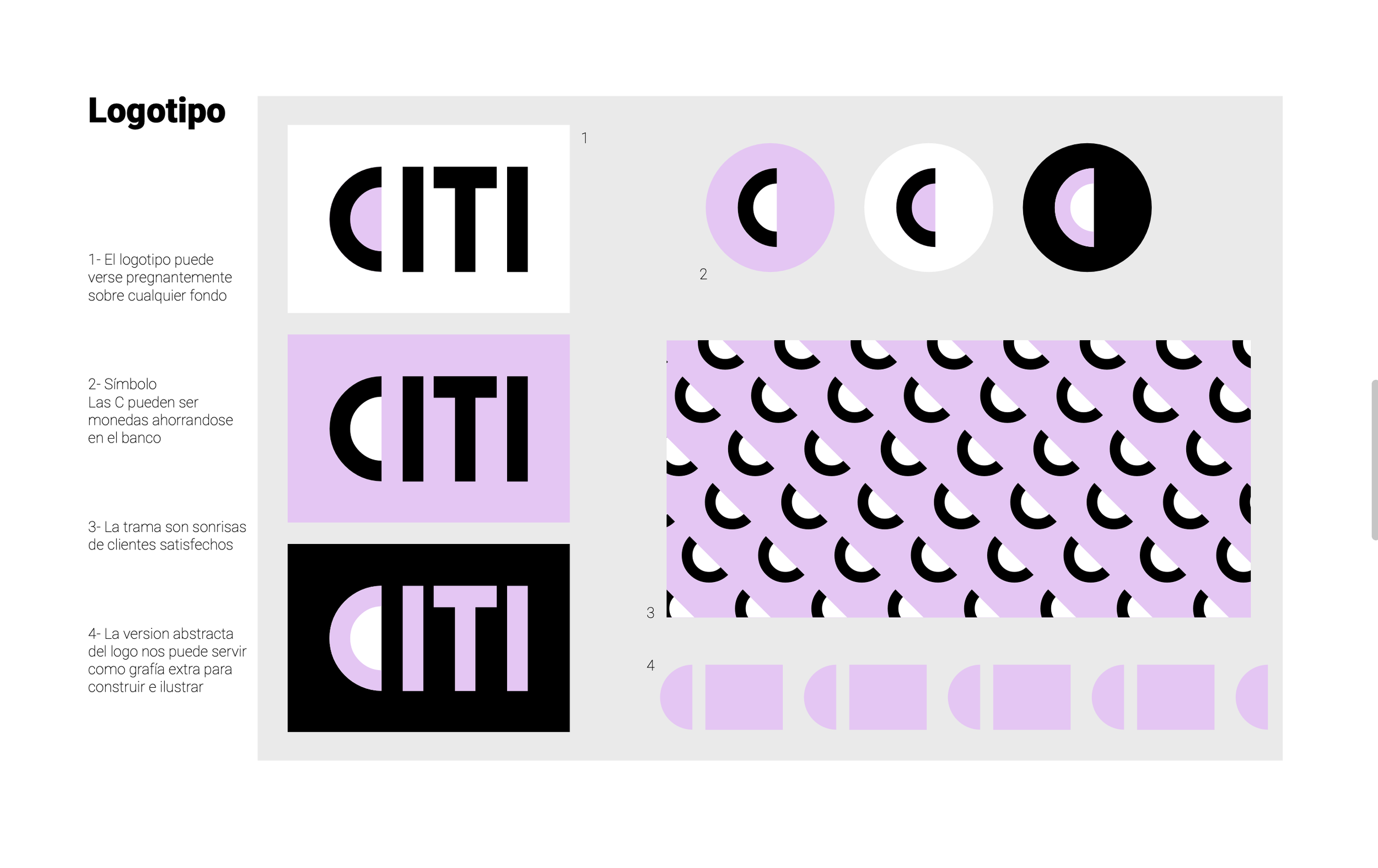
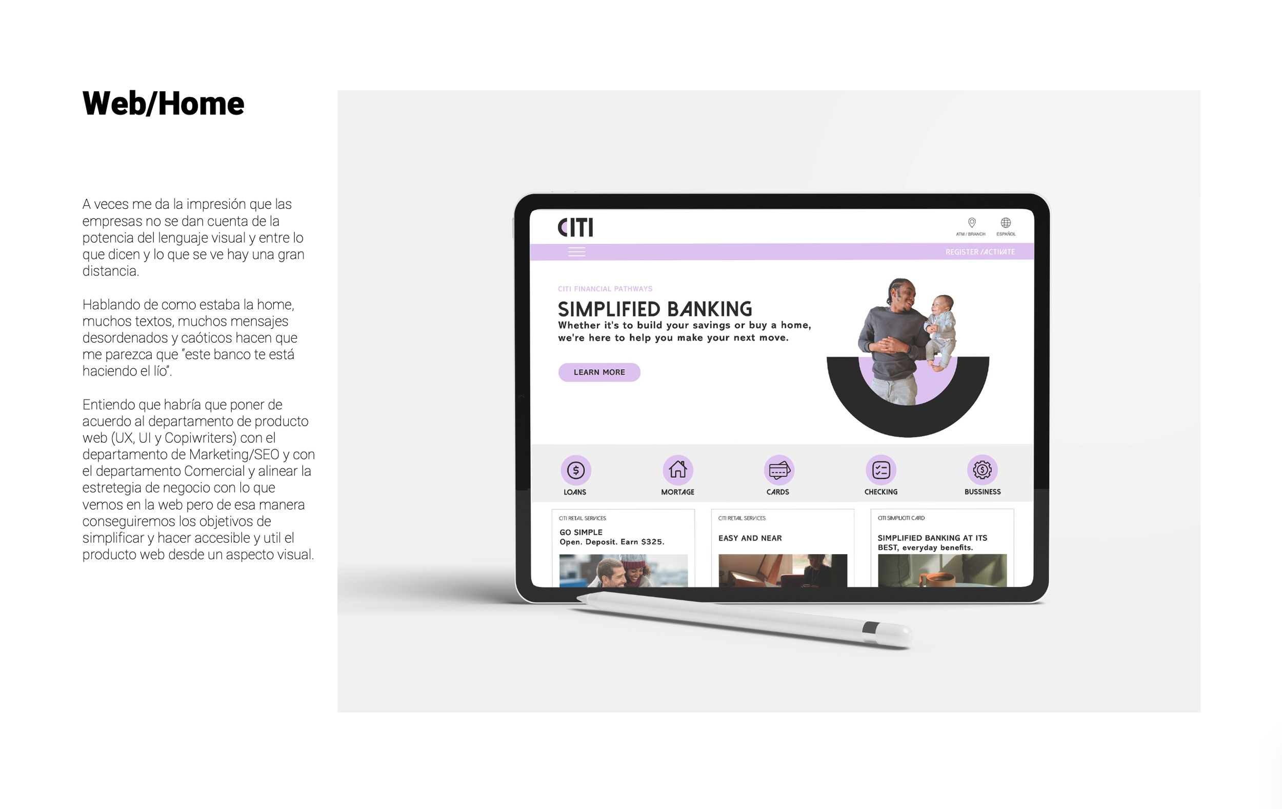
The new graphic language was built around circles, semicircles and geometric shapes, allowing the logo to extend into patterns, illustrations and applications. The concept was then tested across a credit card and a redesigned homepage focused on clearer hierarchy and simpler communication.